
Instead of greeting your users with a wall of text on the page, welcome them with concise, interactive headers and let a More Information pop-up box box do the talking. Your content will be easier for your readers to digest and great for your reporting, as you can see who has engaged with it. It’s the perfect solution for providing additional content without cluttering a page.
-
Navigate to a document, and select 'Design' for the version you wish to work on.
-
Select the ‘Interactivity’ tab at the top of the page.
-
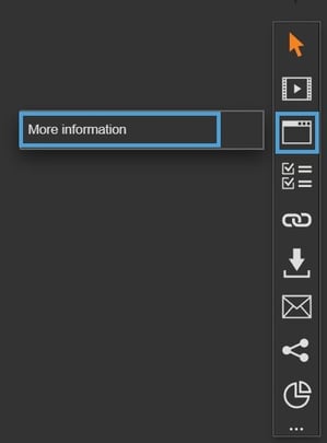
Select the ‘More Information’ module type from the ‘Add Interactivity' palette.
-
Select the ‘More Information’ option.
-
Click and drag out the area to add to your page - this is the clickable area that the visitor will select to view the More Information pop-up box.
-
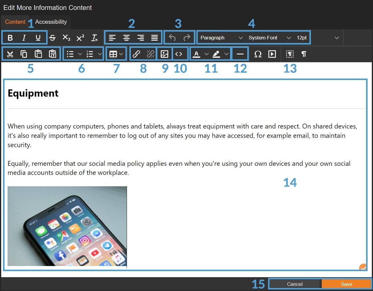
The Content Editor will then open ready for you to begin adding your content, such as text, images or a table.
Content Editor
Various options are available in the content editor; with the most important ones highlighted below.
-
Text formatting (bold, italic, underline).
-
Text alignment (left, centre, right, justified).
-
Undo/Redo.
-
Font formatting, family and size (for example, Paragraph, Arial, 30).
-
Cut, Copy & Paste.
-
Add bullet points or number list.
-
Add table.
-
Add/remove hyperlink.
-
Add image.
-
View/edit source code (html).
-
Text and text background colour.
-
Insert horizontal line (can be useful to add after a heading).
-
Add video.
-
Content area (add any text, images - includes spellchecker).
-
'Cancel' and 'Save' buttons.
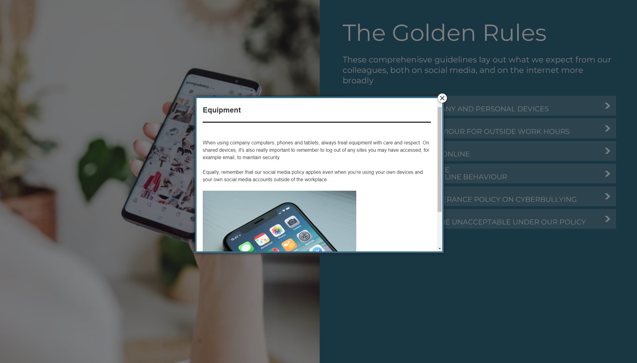
How to add an image
The simplest way to add an image into a More Information pop-up is to drag and drop.
-
Edit the More Information pop-up box.
-
Drag an image from a folder on your computer directly into the Content Editor.
-
The image will be added to the area and can be resized if needed.
How to add a table
A table can be added into a More Information pop-up by using the 'Table' feature.
-
Edit the More Information pop-up box.
-
Select the table icon, followed by 'Table', then choose the required number of rows/columns.
-
Enter your content into the table.
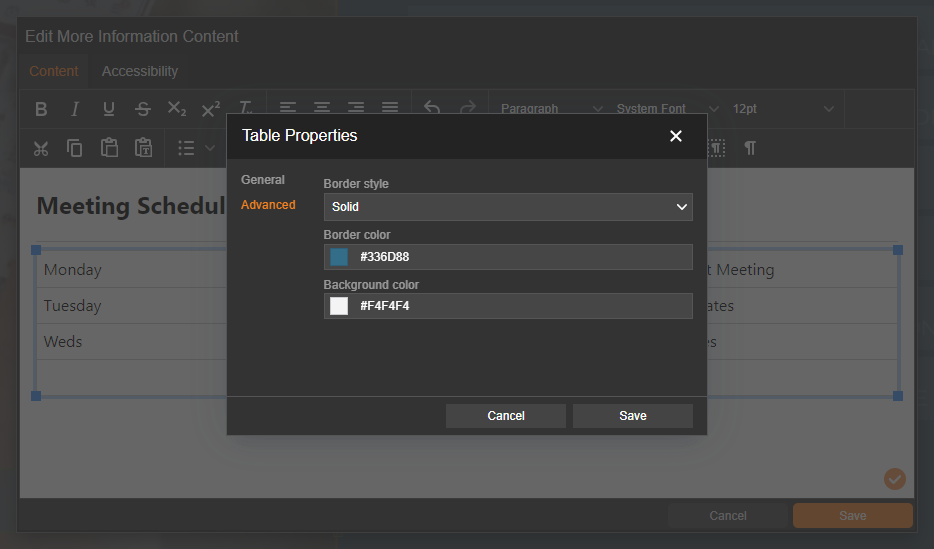
Right-click on the table followed by Cell/Row/Column to add/delete, and control formatting settings, such as border width, style and colour and cell padding in 'Properties'.
Settings
Click on a module already placed on your page to activate the Settings palette. This allows you to configure options like pop-up style and module description.
Name
The 'Name' field is set by default, but it's important to update it to something unique that reflects the interactivity - for example, 'More Information about personal devices', as it will be shown in the Analytics of you document.
Descriptive names make it easier to identify the interactivity used in your document, which is particularly helpful if you're using lots of the same module type.
Interactivity ID
Copy this token and paste it into the 'Activate Interactivity' menu item type to activate the module directly from a menu.
Description
The text entered here will display when a user hovers their cursor over a module. It is also read out by a screen reader when a document is viewed in accessible mode.
Focus Outline Colour
This option can be used if Accessibility has been enabled for your document, and sets the colour of the outline that displays around the piece of interactivity being viewed.
Border Colour
A border adds a keyline around the More Information pop-up box, and can be used as a way to draw attention to your content. Use this field to specify the colour of the border.
Border Size
Use the 'Border Size' field to specify the width of the border around the More Information pop-up box. Enter a numerical value to set the border width - the higher the value, the thicker the border.
Back Colour
The 'Back Colour' field allows you to set a background colour for the More Information pop-up box - select from the colour picker, enter a HEX code, or choose from your brand colours.
Margin Size
Margins create breathing space by adding a separation between the content in a More Information and the border. Enter a numerical value to set the margin size - the higher the value, the larger the margin.
Max Width & Height
Adjust the width and height of the More Information pop-up box. Aim for no larger than 900 to ensure the pop-up box is viewable on different monitor sides.
Disable Close
This option can be selected if you want to prevent the visitor from closing the pop-up box.
Be mindful when using this option, to avoid causing frustration to readers as it can prevent them from navigating further in your document.
Position X & Y
Adjust the position of the clickable area. 'X' sets the position of the left edge and 'Y' sets the top edge.
Width & Height
Adjust the width and height of the clickable area. The size is measured in pts.
Link to Panel
Link the module to a Panel in your document. Once linked, the module will move with the Panel if it is repositioned or resized.