
Enable your visitors to contact or feed back to an email address of your choice, with this easy to use module - it can be added in a couple of clicks and encourages visitors to engage with you more.
- Navigate to a document, and select 'Design' for the version you wish to work on.
- Select the ‘Interactivity’ tab at the top of the page.
- Select the ‘Mailing’ module type from the ‘Add Interactivity' palette.
-
Select the 'Send an Email’ option.

-
Click and drag out the area to add to your page - this is the clickable area that the visitor will select to send an email.
- The 'Properties' pop-up box will then display ready to configure the module.
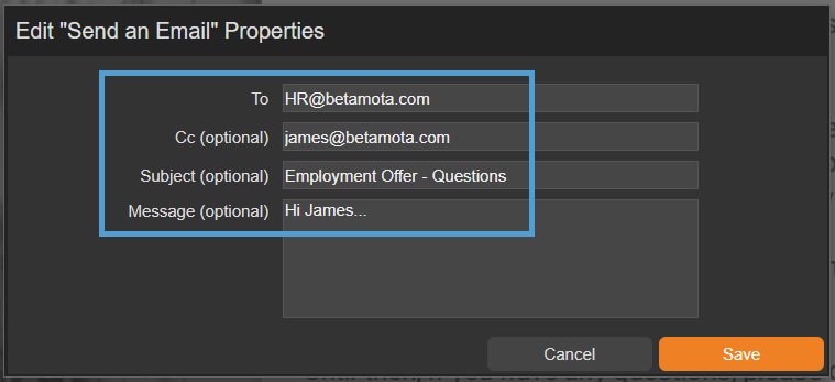
"Send an Email" Properties
To
Enter the email address that you would like to send the emails to. This is the email address that will receive any emails sent by your visitors.
CC (Optional)
Complete this field if you would like to CC an email address into the email that is sent.
Subject (Optional)
Complete this field if you would like to pre-populate a subject heading of the email that is sent.
Message (Optional)
Complete this field if you would like to pre-populate the email with a message.
This module type will attempt to open the visitor’s email app. If they don’t have one set up, it won’t work and they may be asked to configure it.
HR have sent a Employment Offer pack to Lisa and welcome any questions ahead of her start date. They have added a Send an Email module to the pack so she can send an email containing any questions she may have.

Settings
Click on a module already placed on your page to activate the Settings palette. This allows you to configure options like module description and focus outline colour
Name
The 'Name' field is set by default, but it's important to update it to something unique that reflects the interactivity - for example, 'Link to PageTiger website' as it will be shown in the Analytics of you document.
Descriptive names make it easier to identify the interactivity used in your document, which is particularly helpful if you're using lots of the same module type.
Description
The text entered here will display when a user hovers their cursor over a module. It is also read out by a screen reader when a document is viewed in accessible mode.
Focus Outline Colour
This option can be used if Accessibility has been enabled for your document, and sets the colour of the outline that displays around the piece of interactivity being viewed.
Position X & Y
Adjust the position of the clickable area. 'X' sets the position of the left edge and 'Y' sets the top edge.
Width & Height
Adjust the width and height of the clickable area. The size is measured in pts.
Link to Panel
Link the module to a Panel in your document. Once linked, the module will move with the Panel if it is repositioned or resized.