
Components allows you to easily add pre-configured panels that align with your branding, helping to streamline your design process whilst maintaining full control.
All Layout Library page designs have been recreated using Components, and a new 'Components' panel type is now available in the panels palette.

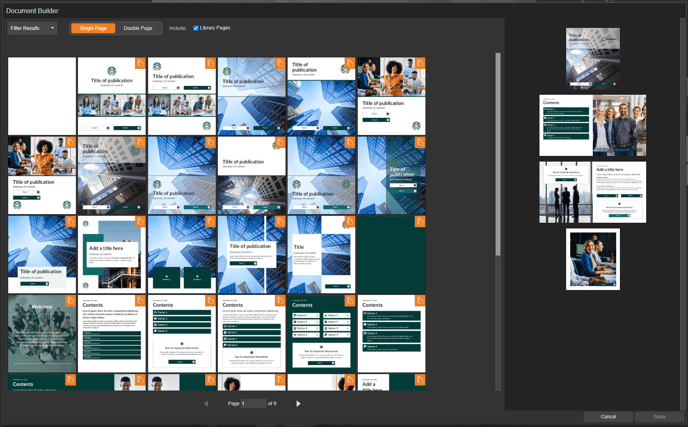
Use the filter to refine your search and help you find the component you need.
- Click on a component to preview it and choose options, such a colour and alignment.
- Select the 'Select Component' button to confirm your selection.

- Now click and drag the component onto your page.
- The component panel will be added to your page ready for you to customise.

Settings
Right-click on the panel to choose a different colour from your branding or select an additional setting, such as alignment and icon position..

Fly-out menu
When you select a panel, more options can be accessed through a convenient fly-out menu.
- Edit Content
Select this option to edit the content of the panel, such as the text or image. - Resize Panel to Fit Component
Select the option to resize the panel to match the original proportions of the component. - Detach Component
Transform the pre-made component into a fully editable panel.
Detaching a component removes the ability to use pre-configured settings, and you will need to manage all settings of the panel manually. This action cannot be undone, so it's important that you're certain before making the selection.

Your branding will be automatically applied to any component you add, helping you maintain consistency with your company’s brand guidelines and ensuring a cohesive appearance throughout your document.
If you have more than one branding available and need to switch, select the second icon from the left-hand menu, followed by 'Select Default Branding'.