
Provide information relating to trends and comparisons in a chart or graph using the Charting module. This module is essential for displaying data in an visual interesting, engaging way, making it easier to digest for visitors.

- Supported file types - .xls and .xlsx.
-
Maximum cells per sheet - 2,500.
-
Maximum cells per file - 10,000.
-
Navigate to a document, and select 'Design' for the version you wish to work on.
-
Select the ‘Interactivity’ tab at the top of the page.
-
Select the ‘Charting’ module type from the ‘Add Interactivity' palette.
-
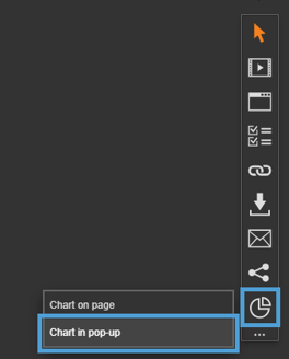
Select the 'Chart in pop-up page’ option.
-
Click and drag out the area to add to your page - this is the clickable area that the visitor will select to view the chart in a pop-up box.
-
Select the chart data that you want to use from the 'Data Resource' drop-down list or upload a new one using the 'Upload' button.
If your spreadsheet has multiple worksheets, you can choose the specific worksheet you need from the 'Worksheet' drop-down menu.
Additionally, you can select a specific range of data from that worksheet using the 'Data Range' section. To do this, simply click and drag your cursor to highlight the desired data.

Settings
Click on a module already placed on your page to activate the Settings palette. This allows you to configure options like subtitles, Chart Type and series colour.
Want to see how your chart is shaping up? Use the preview option in the flyout menu to take a look!

Chart
Name
The 'Name' field is set by default, but it's important to update it to something unique that reflects the interactivity - for example, 'Annual Sales Area Chart', as it will be shown in the Analytics of you document.
Descriptive names make it easier to identify the interactivity in your document, which is particularly helpful if you're using lots of the same module type.
Heading
The heading is the text that will be displayed to the visitor when they view the chart in your document.
Interactivity ID
Copy this token and paste it into the 'Activate Interactivity' menu item type to activate the module directly from a menu.
Description
The text entered here will display when a user hovers their cursor over the chart. It is also read out by a screen reader when a document is viewed in accessible mode.
Chart Type
Choose which type of chart you would like to display your data in.
- Line
- Area
- Bar
- Horizontal Bar
- Stacked Bar
- Pie
- Doughnut
Accessibility
Focus Outline Colour
This option can be used if Accessibility has been enabled for your document, and sets the colour of the outline that displays around the piece of interactivity being viewed.
Popup Style
Border Colour
A border adds a keyline around the pop-up box that the chart is displayed in. Use this field to specify the colour of the border.
Border Size
Use the 'Border Size' field to specify the width of the border around the pop-up box that the chart is displayed in. Enter a numerical value to set the border width - the higher the value, the thicker the border.
Border Colour is also used as the caption text background, so it must contrast with the colour set for Caption Colour.
Back Colour
The 'Back Colour' field allows you to set a background colour for the pop-up box that the chart is displayed in. Be mindful of which colour is used and ensure it compliments the other chart colours, such as text and series colours.
Margin Size
Margins create breathing space by adding a separation between the chart and the pop-up box that it is displayed in. Enter a numerical value to set the margin size - the higher the value, the larger the margin.
Max Width & Height
Adjust the width and height of the pop-up box that the chart is displayed in. Aim for no larger than 900 to ensure the pop-up box is viewable on different monitor sides.
Disable Close
This option can be selected if you want to prevent the visitor from closing the pop-up box.
Be mindful when using this option, to avoid causing frustration to readers as it can prevent them from navigating further in your document.
Chart Data
Switch Rows with Columns
When selected, this option will switch the rows of data in a chart with the columns - so the information displayed in the rows, will change and be displayed as columns instead, and vice-versa.
Begin Series at Zero
Selected by default, this option will display the data from zero on a chart. It can be unselected if the data does not begin at 0, which can make the data clearer to read. This works well with some Area Charts.
First Column/Row as Labels
The below options are selected by default, and unticking them will change how the data in the chart displays.
-
First Column as Labels
-
First Row as Labels
Recommended reading - Chart Terminology
Chart Colours
Text Colour
The 'Text Colour' field allows you to set the colour of text used in the chart - select from the colour picker, enter a HEX code, or choose from your brand colours.
Grid Colour
Gridlines are the horizontal and vertical axis on a chart. Use the 'Grid Colour' field
Show Grid
to set the colour or choose if they are shown on the chart using the 'Show Grid' drop-down list.
Chart Series Colours

Series Border & Width
Add a border around the series of a chart using the Series Border and Width fields. A border can be used to help draw attention to the data or make it easier to interpret.
Vary Colours By Point
If only one Series Colour is chosen, ticking this option sets the chart to vary colours by data point.
Series Colours
Chart Series are the sets of data displayed on a chart - for example, segments on a Doughnut Chart or columns on a Bar Chart. More than one colour can be chosen, which can help make chart data easier to interpret and understand.
-
Use the colour picker to select a colour.
-
Select the plus icon to add another colour.
-
Select the bin icon to delete a colour.
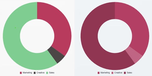
Chart Headings and Labels
Show Heading
The text entered into the 'Heading' field will be displayed above the chart if 'Show Heading' is set to 'Yes'. It should explain what the data in the chart is and should be clear and concise.
Show Tooltips
Tooltips are a small informational text box that displays when hovering over a chart value. It is used to provide further information about a data point and can help encourage engagement from your visitors. Use this option to turn them on or off for the chart.

Show Legend
The Legend is an information box containing colour-keyed labels that helps your visitors understand what they are looking at, by explaining what each bar/line represents. Use this option to turn it on or off for the chart.

Axis Labels and Headings
Axis are the lines that are used to measure the data in a chart.
There are two types of axes:
- horizontal axis is usually called the 'x-axis'.
- vertical axis is usually called the 'y-axis'.
Use the Label and Heading options to enter a name (Heading) for the axis and choose if it will be displayed on the chart (Labels).
Caption
Add a caption to a chart to provide additional content about the chart data. Although not mandatory, it can be helpful for your visitors to understand more about the data.
Show Caption
If you have added a caption to your chart, this option allows you to choose when it displays in the pop-up box. Choose from 'Toggleable', which requires the visitor to select an information icon to display the caption, 'Always' or 'Never'.
Caption Position
If you have added a caption to your chart, this option allows you to choose where it will display in the pop-up box. Choose from 'Top' or 'Bottom'.

Caption Colour
If you have added a caption to your chart, this option allows you to choose the text colour.

For accessibility, ensure the caption colour contrasts clearly with the border colour, as the border is used as the colour behind the text."
Clickable Area
Position X & Y
Adjust the position of where the chart sits on the page. 'X' sets the position of the left edge and 'Y' sets the top edge.
Width & Height
Adjust the width and height of the clickable area. The size is measured in pts.
Link to Panel
Link the module to a Panel in your document. Once linked, the module will move with the Panel if it is repositioned or resized.
Editing Chart Data
The data of an uploaded spreadsheet can be edited in the Data Resources Manager. This can be useful if a cell name needs updating or an figure needs altering.
-
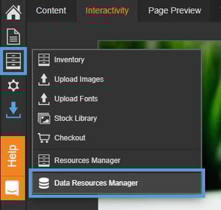
Select the Inventory Tools option from the left-hand menu.
-
Select 'Data Resources Manager'.
-
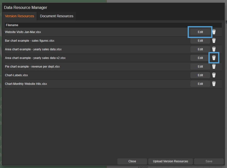
Select the 'Edit' option for the spreadsheet you need to make amendments to.
A Data Resource can also be deleted from this section using the 'bin' icon.
-
Double-click in a cell to make an amendment.

-
Select the 'Save' button to save any changes.
If the Data Resource is in use, it will automatically update.
Copying a document that contains chart data
When you create a copy or duplicate of a document, all associated Data Resources (spreadsheets) used within it will be copied.
Any Data Resources (spreadsheets) not used in the document will not be included.