
A survey is a quick and easy way to gather feedback from your visitors. Although set up similarly to the Assessment/Test module, there is no scoring as your visitors do not pass or fail, they simply provide you with their views and opinions.
-
Select the ‘Assessment’ type from the ‘Add Interactivity' palette.
-
Select the 'Survey' option.

-
Click and drag out the area to add to your page - this is the area that the visitor will click to open the survey.
-
A pop-up box will then open ready for you to add questions, answers and results.
How to add questions and answers
-
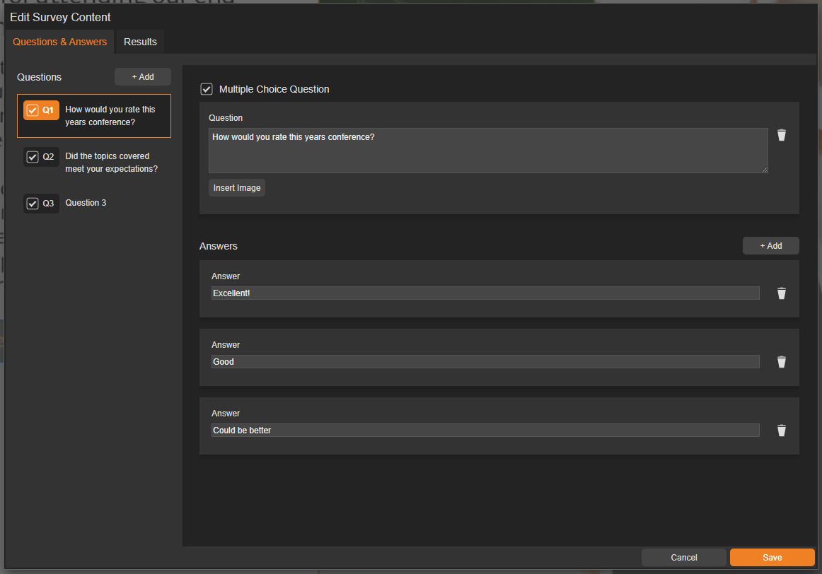
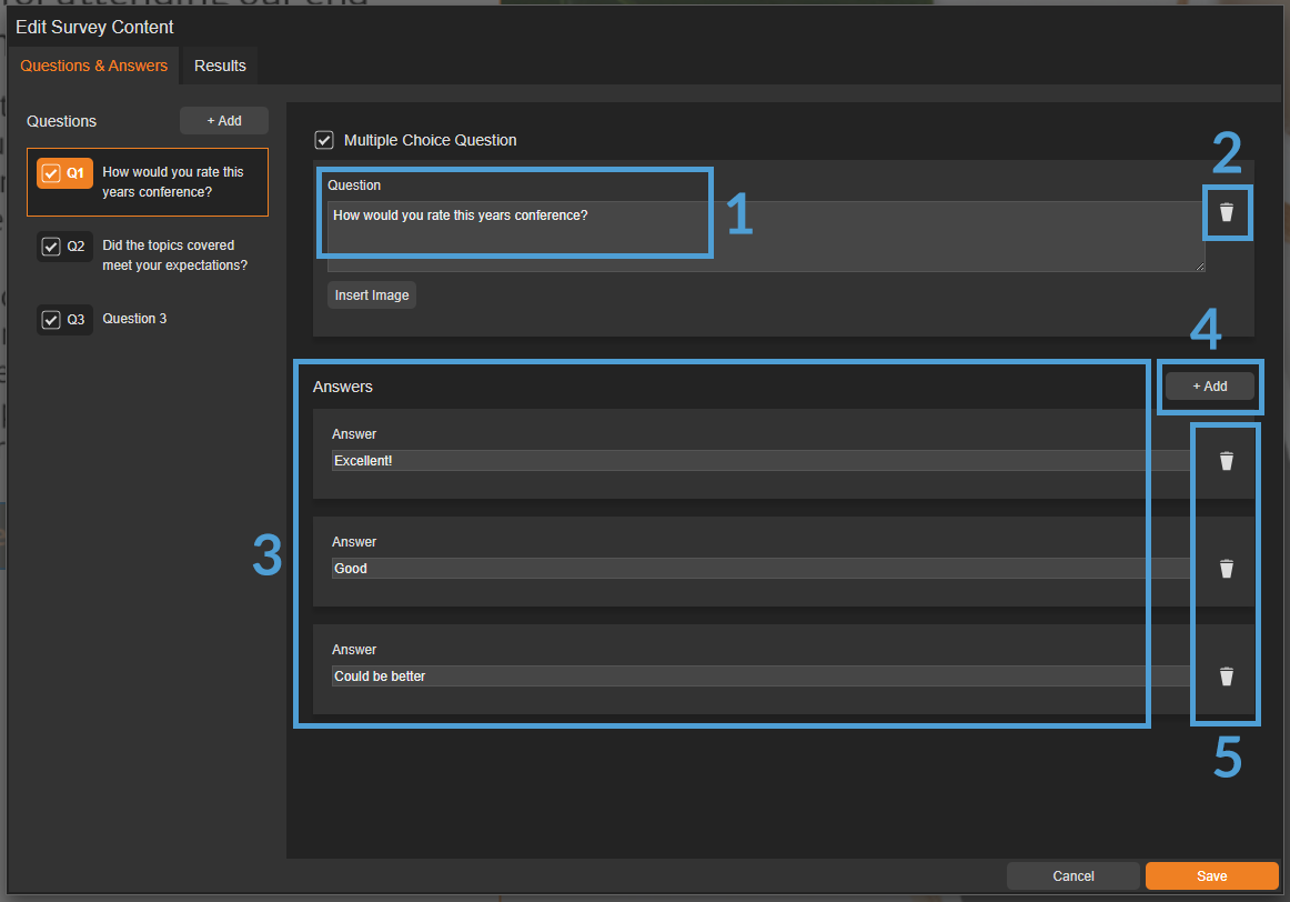
Add your question into the 'Question' field.
-
Use the small bin icon to delete a question.
-
Add the answer(s) into the 'Answers' section.
-
Use the 'Add' button to add another answer.
-
Use the small bin icon to delete an answer.
It's possible to add an image to a question by selecting the 'Insert Image' button. Although not mandatory, it can be used to support your question or add visual interest.
Adding a Result
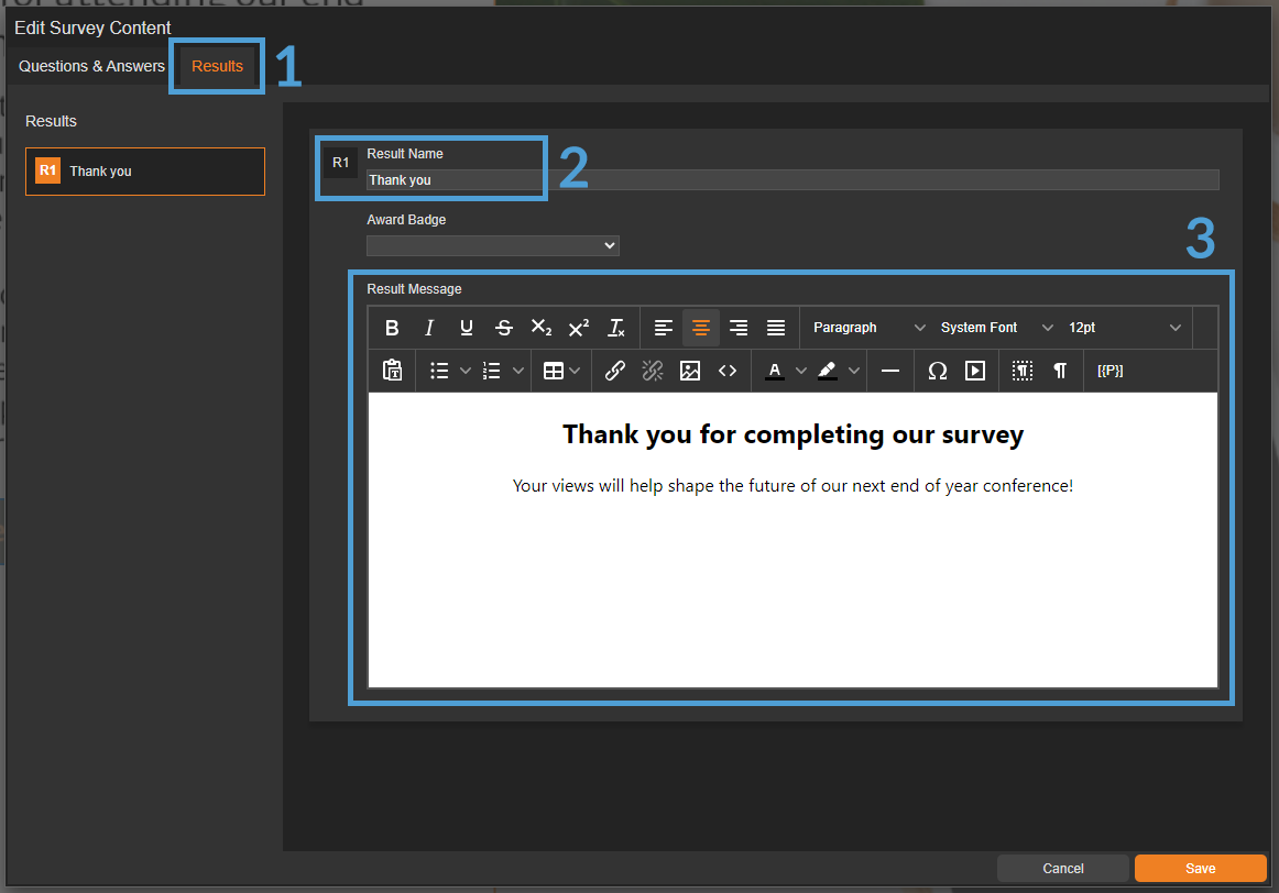
A 'result' is a pop-up box that displays once a visitor has submitted a survey. It's a useful way to thank them for completing the survey, or provide additional information to them.
-
Select the 'Results tab'.
-
Enter a suitable name in the 'Result Name' field (For example, Thank You).
-
Enter some text into the 'Result Message' field - this is the text that the visitor will see once they have submitted the survey.
Settings
Click on a module already placed on your page to activate the Settings palette. Some settings, like border colour and size, are simple visual adjustments, while others can affect how the module functions.
Name
The 'Name' field is set by default, but it's important to update it to something unique that reflects the interactivity - for example, 'Survey', as it will be shown in the Analytics of you document.
Descriptive names make it easier to identify the interactivity in your document, which is particularly helpful if you're using lots of the same module type.
Heading
The heading is the text that will be displayed to the visitor when they view the survey in your document - for example, 'Take our annual staff survey!'.
Interactivity ID
Copy this token and paste it into the 'Activate Interactivity' menu item type to activate the module directly from a menu.
Description
The text entered here will display when a user hovers their cursor over the chart. It is also read out by a screen reader when a document is viewed in accessible mode.
Capture Email Address
Select whether to ask the visitor for their email address. This helps track submissions in the analytics of your document and also enables the 'Max Attempts' option.
If the email has already been captured in the security rule of the document, the visitor won’t need to re-enter it!
Max Attempts
Choose how many times someone can take the survey. Setting a limit helps keep your data clean and prevents users from retaking it over and over.
Be mindful when using this feature - if you are collating views or suggestions for something such as a work event, do you really want visitors to be able to to complete it more than once?
Questions
One Question at a Time
Choose if the questions will display individually or all at once within the pop-up box.
Answers
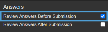
Review Answers Before Submission
Enabling this option allows visitors to review their answers and make any necessary changes before submitting the survey.
Review Answers After Submission
This option allows you to deliver feedback or additional information once an survey has been submitted.
-
Edit the survey and enter your feedback into the 'After submission feedback' fields.
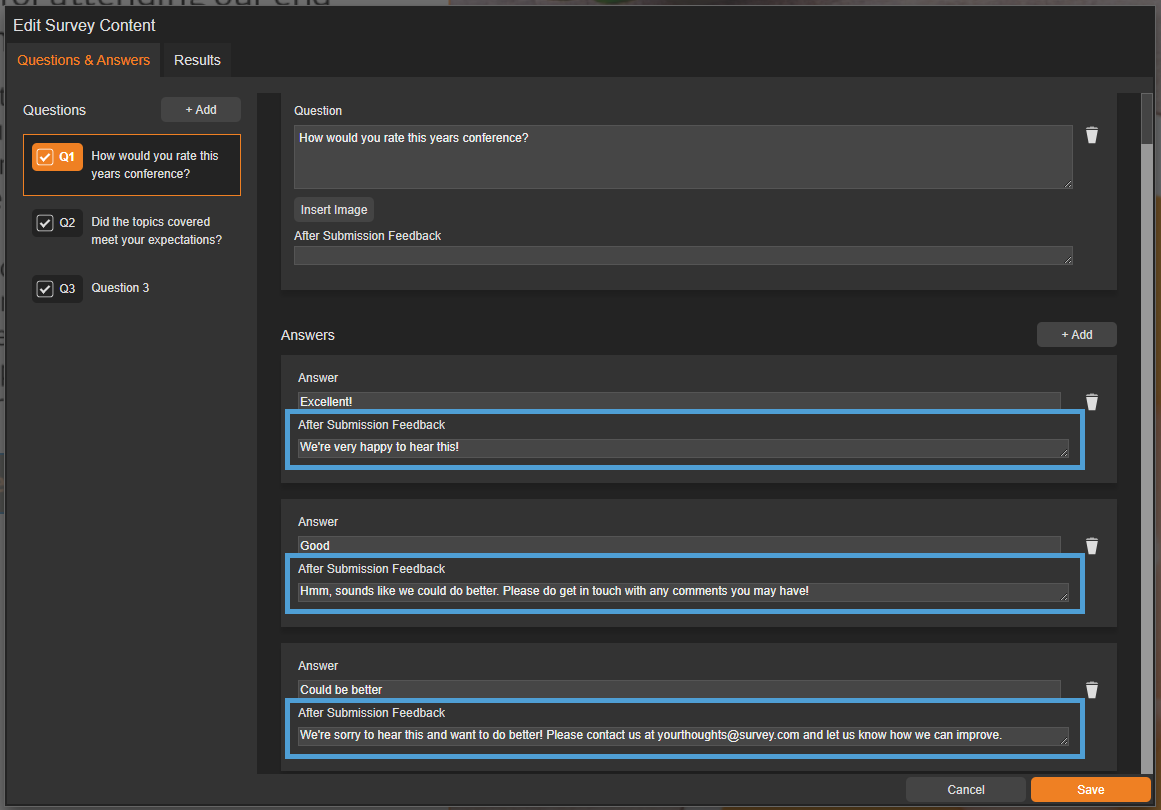
Feedback can be entered for questions and their corresponding answers - remember to keep it clear and concise!
- When a visitor submits, they will be shown the submission feedback.

Accessibility
Focus Outline Colour
This option can be used if Accessibility has been enabled for your document, and sets the colour of the outline that displays around the piece of interactivity being viewed.
Popup Style
Border Colour
A border adds a keyline around the pop-up box that the survey is displayed in. Use this field to specify the colour of the border.
Border Size
Use the 'Border Size' field to specify the width of the border around the pop-up box that the survey is displayed in. Enter a numerical value to set the border width - the higher the value, the thicker the border.
Back Colour
The 'Back Colour' field allows you to set a background colour for the pop-up box that the survey is displayed in.
Margin Size
Margins create breathing space by adding a separation between the survey and the pop-up box that it is displayed in. Enter a numerical value to set the margin size - the higher the value, the larger the margin.
Max Width & Height
Adjust the width and height of the pop-up box that the survey is displayed in. Aim for no larger than 900 to ensure the pop-up box is viewable on different monitor sides.
Disable Close
This option can be selected if you want to prevent the visitor from closing the survey pop-up box.
Be mindful when using this option, to avoid causing frustration to readers as it can prevent them from navigating further in your document.
Result 1 Style
This section mirrors the 'Popup Style' settings above, but applies to the Results pop-up shown after the survey is submitted.
Clickable Area
Position X & Y
Adjust the position of where the clickable area sits on the page. 'X' sets the position of the left edge and 'Y' sets the top edge.
Width & Height
Adjust the width and height of the clickable area. The size is measured in pts.
Link to Panel
Link the module to a Panel in your document. Once linked, the module will move with the Panel if it is repositioned or resized.