
When creating an assessment, you'll have access to a range of settings. Some, like border colour and size, are simple visual adjustments, while others can affect how the module functions. This section will walk you through each setting so you can configure your module with confidence!
To activate the Settings palette, click on an assessment module already placed on your page.
Assessment
Name
The 'Name' field is set by default, but it's important to update it to something unique that reflects the interactivity - for example, 'Quiz - Social Media Policy', as it will be shown in the Analytics of you document.
Descriptive names make it easier to identify the interactivity in your document, which is particularly helpful if you're using lots of the same module type.
Heading
The heading is the text that will be displayed to the visitor when they view the assessment in your document - for example, 'Test Your Knowledge!'.
Interactivity ID
Copy this token and paste it into the 'Activate Interactivity' menu item type to activate the module directly from a menu.
Description
The text entered here will display when a user hovers their cursor over the chart. It is also read out by a screen reader when a document is viewed in accessible mode.
Capture Email Address
Select whether to ask the visitor for their email address. This helps track submissions in the analytics of your document and also enables the 'Max Attempts' option.
If the email has already been captured in the security rule of the document, the visitor won’t need to re-enter it in the assessment!
Max Attempts
Choose how many times someone can take the assessment. Setting a limit helps keep your data clean and prevents users from retaking it over and over. The visitor will be shown the number of remaining attempts on the last screen of the assessment.

This is a powerful feature, so use it thoughtfully! For example, limiting a visitor to just one attempt to accept a job offer isn’t recommended - mistakes can happen, and it’s best to give them a chance to correct or retry if needed.
Hide Retry Button
Checking this box will hide the 'Retry' button from appearing in the results pop-up, so visitors won’t be able to take the assessment again.
Questions
Advanced Scoring Mode
Selecting this option allows you to assign a score to each answer within a question, giving you control over how different results are calculated.
One Question at a Time
Choose if the questions will display individually or all at once within the pop-up box.

Answers
Review Answers Before Submission
Enabling this option allows visitors to review their answers and make any necessary changes before submitting the assessment.

Review Answers After Submission
This option allows you to deliver feedback once an assessment has been submitted, which can help to support knowledge retention and reinforce learning outcomes.
- Select the 'Review Answers After Submission' checkbox.

-
Edit the assessment and enter your feedback into the 'After submission feedback' fields.
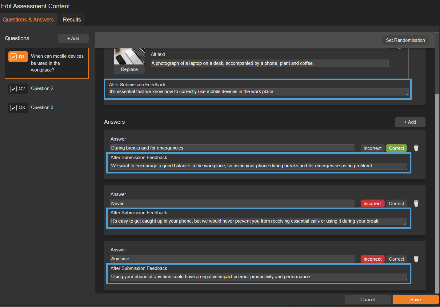
Feedback can be entered for questions and their corresponding answers - remember to keep it clear and concise!
- When a visitor submits an assessment, they will be shown the feedback.

Accessibility
Focus Outline Colour
This option can be used if Accessibility has been enabled for your document, and sets the colour of the outline that displays around the piece of interactivity being viewed.
Popup Style
Border Colour
A border adds a keyline around the pop-up box that the assessment is displayed in. Use this field to specify the colour of the border.
Border Size
Use the 'Border Size' field to specify the width of the border around the pop-up box that the assessment is displayed in. Enter a numerical value to set the border width - the higher the value, the thicker the border.
Back Colour
The 'Back Colour' field allows you to set a background colour for the pop-up box that the assessment is displayed in.
Margin Size
Margins create breathing space by adding a separation between the assessment and the pop-up box that it is displayed in. Enter a numerical value to set the margin size - the higher the value, the larger the margin.
Max Width & Height
Adjust the width and height of the pop-up box that the assessment is displayed in. Aim for no larger than 900 to ensure the pop-up box is viewable on different monitor sides.
Disable Close
This option can be selected if you want to prevent the visitor from closing the assessment pop-up box.
Be mindful when using this option, to avoid causing frustration to readers as it can prevent them from navigating further in your document.
Result 1/2 Style
This section mirrors the 'Popup Style' settings above, but applies to the Results pop-up shown after the assessment is submitted.
Clickable Area
Position X & Y
Adjust the position of where the clickable area sits on the page. 'X' sets the position of the left edge and 'Y' sets the top edge.
Width & Height
Adjust the width and height of the clickable area. The size is measured in pts.
Link to Panel
Link the module to a Panel in your document. Once linked, the module will move with the Panel if it is repositioned or resized.