
Studies show that viewers retain 95% of a video’s message compared to 10% when reading text, so why not consider adding one to your content? They're a great tool for creating more engaging content, as well as delivering a message to your readers in a more digestible and enjoyable way.

-
Maximum file size - 500MB.
-
Supported file types - webm, mkv, flv, ogv, ogg, avi, mov, wmv, mp4, mpg, mpeg, mpv, m2v, 3gp.
-
A video file can be uploaded directly to the module as a version resource - when using this option select the refresh icon to refresh the list of resources available.
-
A video file can also be uploaded to your Resources Manager - this is useful if you wish to upload more than one resource or use the file in all versions of a document.
-
Navigate to a document, and select 'Design' for the version you wish to work on.
-
Select the ‘Interactivity’ tab at the top of the page.
-
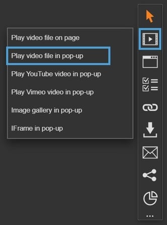
Select the ‘Media’ module type from the ‘Add Interactivity' palette.
-
Select the ‘Play video file in pop-up’ option.
-
Click and drag out the area to add to your page - this is the clickable area that the visitor will select to view the video in a pop-up box.

-
You can add a video in one of three ways, simply choose the option that works best for you:
- Generate a New Video
Choose a presenter, enter your script, and create a new video instantly using AI! - Upload a Video
Upload your own video as a version or document resource. Simply drag and drop or select the 'Add Files' button. - Select an Existing Video
Select a video that has been previously uploaded to your document or version.

Instantly create engaging videos with AI using our Video Generator.
Settings
Click on a module already placed on your page to activate the Settings palette. This allows you to configure options like subtitles, video controls, and module description.
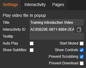
Name
The 'Name' field is set by default, but it's important to update it to something unique that reflects the interactivity - for example, 'Bright Ideas Video' as it will be shown in the Analytics of you document.
Descriptive names make it easier to identify the interactivity used in your document, which is particularly helpful if you're using lots of the same module type.
Interactivity ID
Copy this token and paste it into the 'Activate Interactivity' menu item type to activate the module directly from a menu.
Description
The text entered here will display when a user hovers their cursor over a module. It is also read out by a screen reader when a document is viewed in accessible mode.
Auto Play
Select the 'Auto Play' checkbox to automatically play the video on the page.
Start Muted
Select the 'Start Muted' checkbox to play the video without sound - the visitor has control to enable sound.
Most modern browsers now implement strict policies around auto-playing and muting in order to provide greater control of playback to viewers. Although each browser will have its own policy, they generally follow similar guidelines - please be mindful of this, as there may be times that your chosen settings are not respected.
Show Subtitles
This option is ticked by default and ensures any subtitles added to your video are set to display.
Subtitles are essential for creating inclusive content - it provides content to people who are deaf and hard-of-hearing, as well as helping viewers who process written information better than audio. Subtitles can also be helpful for people consuming videos in a noisy environments.
Show Controls
The Control Bar is set to display by default and allows the visitor to control video playback, such as volume, seeking, and pause/resume.
If your video is set to auto play, the control bar will always display and cannot be hidden. This is to ensure the visitor can control the playback.
Prevent Scrubbing
Select the 'Prevent Scrubbing' checkbox to prevent visitors from skipping ahead in the video. This is a great option if you would like the whole video to be watched.
Prevent Download
Select this option to hide the download option from the video, preventing the visitor from downloading/saving a copy. It's a useful feature if you don't want your video to be accessed outside of your document.
Focus Outline Colour
This option can be used if Accessibility has been enabled for your document, and sets the colour of the outline that displays around the piece of interactivity being viewed.
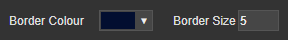
Border Colour
A border adds a keyline around your on-page video, and can be used as a way to draw attention to your content. Use this field to specify the colour of the border.
Border Size
Use the 'Border Size' field to specify the width of the border around the video. Enter a numerical value to set the border width - the higher the value, the thicker the border.
Back Colour
The 'Back Colour' field allows you to set the background colour of the box that the video is displayed in - select from the colour picker, enter a HEX code, or choose from your brand colours. Think about the choice of colour - it can reflect your brand personality, as well as evoke emotions or draw attention to content.
Margin Size
Margins create breathing space by adding a clear separation between the video and the pop-up box that it is displayed in. Enter a numerical value to set the margin size - the higher the value, the larger the margin.
Max Width & Max Height
Adjust the width and height of the pop-up box that the video will be displayed in. The size is measured in pts and should be the same ratio as your video file.
Position X & Y
Adjust the position of the clickable area. 'X' sets the position of the left edge and 'Y' sets the top edge.
Width & Height
Adjust the width and height of the clickable area. The size is measured in pts.
Link to Panel
Link the module to a Panel in your Document. Once linked, the module will move with the Panel if it is repositioned or resized.