
Using a gallery to showcase your portfolio couldn’t be easier with an interactive Image Gallery. Auto-play your images and add personalised captions to provide an engaging way for your visitors to see the latest photographs from company events or familiarise new colleagues with team introductions.

-
Navigate to a document, and select 'Design' for the version you wish to work on.
-
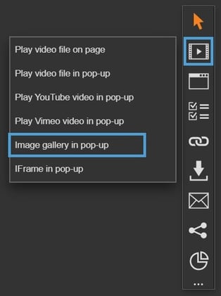
Select the ‘Interactivity’ tab at the top of the page.
-
Select the ‘Media’ module type from the ‘Add Interactivity' palette (found to the right of the page).
-
Select the ‘Image Gallery in pop-up’ option.
-
Click and drag out the area to add to your page - this is the clickable area that the visitor will select to view the image gallery in a pop-up box.
-
Drag your image files into the box or select 'Add Files' to add images.
-
Once done, select the 'Start Upload' button to upload the files to the gallery.
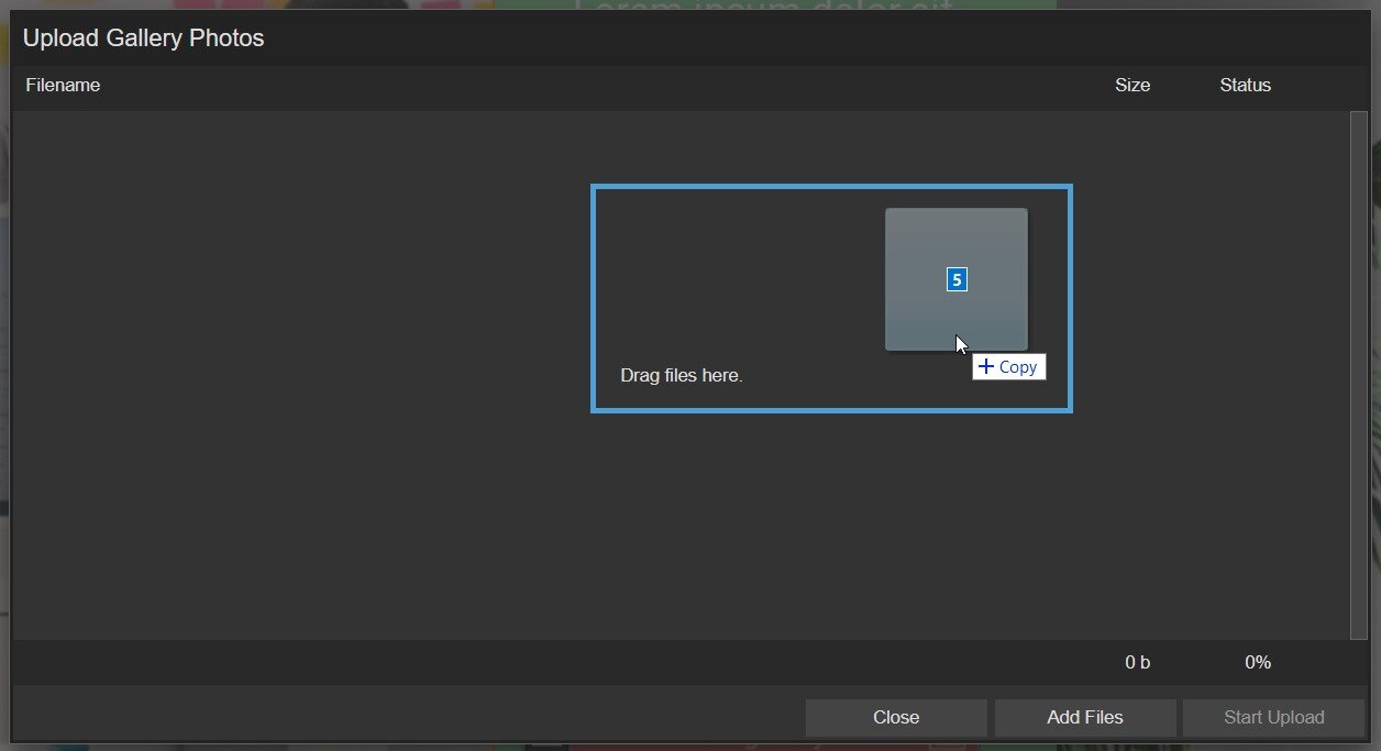
This following file types supported - .jpg, .pjpeg, .jpeg, .png, and .gif.
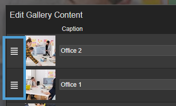
Re-order an image
-
Select the sorting icon that appears to the left of an image.
-
Click and drag the image into position.
-
Select 'Save' to save your changes.
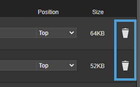
Delete an image
-
Select the bin icon found to the right of an image to delete it.
-
Select 'Save' to save your changes.
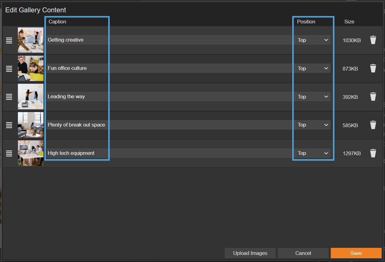
Caption an image
By default, the filename of the image will be used in the caption field, however, this can be changed to your preference, which is important for accessible users and if you have Show Info set to display.
-
Simply type in the text and choose the position of the caption (Top/Bottom).
Explore the Settings section to choose when you would like captions to display.
Settings
Click on a module already placed on your page to activate the Settings palette. This allows you to configure options like gallery controls and module description.
Name
The 'Name' field is set by default, but it's important to update it to something unique that reflects the interactivity - for example, 'Image Gallery - Hatters', as it will be shown in the Analytics of you document.
Descriptive names make it easier to identify the interactivity in your document, which is particularly helpful if you're using lots of the same module type.
Interactivity ID
Copy this token and paste it into the 'Activate Interactivity' menu item type to activate the module directly from a menu.
Description
The text entered here will display when a user hovers their cursor over a module. It is also read out by a screen reader when a document is viewed in accessible mode.
Interval
Choose how long each image will display for before changing to the next - this value must be set, but will be ignored if the gallery is not set to auto-play. Choose from every 3 seconds, up to 1 minute.
Show Info
If you have added captions to your images, this option allows you to choose when they display in the gallery. Choose from 'Toggleable', which requires the visitor to hover over an information icon to display the caption, 'Always' or 'Never'.
Info Text Colour
If you have added captions to your images, this option allows you to choose the text colour.
Info Text Colour colour should contrast with the Border Colour of the module to ensure it is legible. This is because the colour set as the Border Colour is shown behind the caption text.

Auto Play
Select the checkbox for Auto Play if you would like the slideshow of images play automatically. If this is not set, your visitors will be required to click through manually to view the gallery.
An auto-playing slideshow can be paused at any point, so the visitor can spend longer viewing an image if needed.
Loop
Select the Loop checkbox if you would like the slideshow of images to continue to play until it is closed. If this option is not selected, the gallery will close after one cycle of the images.
Focus Outline Colour
This option can be used if Accessibility has been enabled for your document, and sets the colour of the outline that displays around the piece of interactivity being viewed.
Border Colour
A border adds a keyline around the video pop-up box, and can be used as a way to draw attention to your content. Use this field to specify the colour of the border.
Border Size
Use the 'Border Size' field to specify the width of the border around the video pop-up box. Enter a numerical value to set the border width - the higher the value, the thicker the border.
The Border Colour is also used as the caption text background, so remember to ensure it contrasts with the colour set for Info Text Colour.
Back Colour
The 'Back Colour' field allows you to set a background colour for the gallery pop-up box - select from the colour picker, enter a HEX code, or choose from your brand colours.
Margin Size
Margins create breathing space by adding a separation between the images in the gallery and the pop-up box. Enter a numerical value to set the margin size - the higher the value, the larger the margin.
Width & Height
Adjust the width and height of the pop-up box that the image gallery will be displayed in. Aim for no larger than 900 to ensure the gallery is viewable on different monitor sides. The larger dimension (width or height) of the image will be assigned the value in this field, and the smaller dimension will be sized automatically based on the ratio of the image.
Disable Close
This option can be selected if you want to prevent the visitor from closing the video pop-up box.
Be mindful when using this option, to avoid causing frustration to readers as it can prevent them from navigating further in your document.
Position X & Y
Adjust the position of the clickable area. 'X' sets the position of the left edge and 'Y' sets the top edge.
Width & Height
Adjust the width and height of the clickable area. The size is measured in pts.
Link to Panel
Link the module to a Panel in your document. Once linked, the module will move with the Panel if it is repositioned or resized.